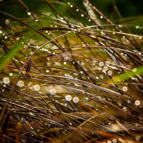
Serenity Beach

I was asked how do you embody Serenity in a photograph, we’ll this one was is easy for me, the beach at Filey on a cold winters day is a place of utmost tranquility, peacefulness and serenity, especially when it’s secluded, apart from the odd dog walker, which is exactly what I was doing on the day I took these photos while my nine year old Jack Russell ran around with the boundless joy of a puppy…I guess she was having a serenity moment as well.

The real beauty for me of this serene beach in the harshness of winter, it allows you to switch off completely from the outside world, and soak up the beach and become one with the sounds, smells and scenery stretched out in front of you… My pure heaven.

Craig Drake’s Art of Star Wars

Star Wars Celebration is just a few short months and the official Star Wars website has just revealed some key art from the event. The posters are a pure Mondo art form unto themselves, and for an artist to capture the essence of Star Wars on a poster — the feel and look of the films, the drama of the stories isn’t easy…but Star Wars Celebration is in safe hands with my favourite Mondo artist, the incredibly gifted Craig Drake, who’s produced some stunning new  artwork for April’s mega-event.

These standalone Mondo portraits of Boba Fett and a ‘Original Trilogy’ Stormtrooper he posted on his Facebook page will make a timeless poster on any Star Wars fans wall.

He even posted some new Leia artwork on his Tumblr site, a standalone variant of Leia from the Star Wars Celebration poster, and ‘Empire Leia’ in her Hoth outfit, which is quite reminiscent of his first Leia artwork.

What I found out most recently about him, was his love of fellow Star Wars Poster artist Drew Struzan and the legendary concept artist Ralph McQuarrie, and also having been a senior designer at Star Wars.com, you know he has an inherent love of the SW Universe, which really shows in his work.

Craig Drake’s Interview with Star Wars.com

Drake loves and knows Star Wars, having worked at Lucasfilm for seven years as the senior designer of StarWars.com, and he has that rare ability to convey what we love about a galaxy far, far away in an immediate, almost subconscious way. In his poster, there are classic Star Wars elements: the overwhelming power of Darth Vader, dark and light colors in a sort of harmonious conflict, and a sense of Star Wars-branded danger and excitement. The style, however, is all Drake’s: the lines are sharp, the details simple, the colors bold. Ultimately, the image successfully adapts his style into the language of a movie poster. So how did he do it?

“I essentially took the basic line art that I usually do, that’s very recognizable, and painted over it,” Drake tells StarWars.com. “Before I even did that, I took a look at the [legendary movie- and Star Wars-poster artist] Drew Struzan’s of the world and how those color palettes feel. So, the basis for what I usually do is there, it’s just underneath a lot of color enhancement and free-hand painting, just to dial it up a bit, and I think it added a nice touch that made it feel more filmic.” It’s a method that allows Drake to employ his own style while still making something that’s familiar. Yet, upon closer inspection, it’s not THAT familiar — Han, the stormtrooper, Leia, and Vader all look and feel the part, but their poses can’t quite be placed in a specific movie scene. The expressions match the characters, but they’re kind of new, too. That unfamiliar familiarity, it turns out, is intentional.

“I like to go into the films and take screen caps for reference, versus the style-guide art,” Drake says. “Style guides are asset kits [given to artists and third parties]. It’s a wealth of images. You see those poses used quite a bit in posters and packaging, so I wanted to dig a little deeper into the films themselves.” His process involves scanning scenes with an eye toward the unusual, or something rarely seen. When it came to Vader, Drake had a clear goal. “I was trying to get this very perfect side view, a really great profile. You don’t see Vader from the side very often, and I think it’s a neat shape. I grabbed a shot from Episode V that worked really, really well.” The result is striking. Vader is cast as a grand, ominous figure, almost engulfing all others; the side view seems new, and the arched angle, with Vader looking upward, hints at the tragedy and internal struggle of the fallen Jedi.

..You don’t see Vader from the side very often, and I think it’s a neat shape

And if the star-filled Vader rings a visual bell, that’s because it’s meant to — the effect is taken directly from the original Empire Strikes Back theatrical poster. “That’s exactly what I lifted,” Drake says. “I’ll admit it. The very first soundtrack LP I got was The Empire Strikes Back, and that was the cover. So, that’s burned in my mind, and I kind of wanted to emulate it a bit. I like the stars sort of bleeding through. It’s a very cool effect.”

When Drake can’t find a shot that matches what he sees in his head, he gets even more creative, mashing up different character appearances to create a new image. “Specifically, the one that [technique] worked for was the Leia profile shot,” he says. “I got that reference from the medal ceremony at the end of Episode IV. She had a different hairdo, so I got her face from that, and then did her hair from memory.” Leia wasn’t always a sure thing for the final poster, however. Originally, Drake explored different character options and color choices — with a much greater focus on the dark side (for lack of better term) of Star Wars — revealed below for the first time anywhere.

“I initially was given quite a bit of freedom to tackle a theme,” Drake says of the early process, “and that’s how I came up with the first version, featuring Boba [Fett], Vader, and the stormtrooper.” His inspiration came not from a specific love of the bad guys, though. It was borne more out of the spirit of Star Wars Celebration. “I really thought of it from the fan perspective,” he says. “You know, at those events, people dress up. Especially the 501st Legion, with everyone crafting their costumes. It seems to be the stormtroopers, Boba Fetts, and Vaders are the heavy focus in terms of costumes. Those are just iconic, wonderful shapes to actually illustrate. And I think through that process, we quickly decided, these are neat looking, but we actually wanted to include human faces and build it out like a traditional movie poster with a variety of characters.” This led to the second attempt, also seen above, which saw a new layout and added a certain sharp-shooting princess; finally, the third time was the charm, as the Han-focused illustration struck the right balance of heroes, villains, and energy. By looking at earlier versions of the poster in comparison with the final art, however, certain elements emerge that harken back to core Star Wars designs.

star-wars-celebration-2015-official-leia-poster-artwork-by-craig-drake

One motif visible in each stage of the poster’s evolution is a diamond or wedge shape — sometimes explicit, sometimes in the form of rays of light, sometimes swallowing the image up from Darth Vader’s cape or helmet. That, also, is intentional. “There’s a behind-the-scenes clip where George [Lucas] was talking about the wedge shape, the triangular shape,” Drake says, “and how it’s a repeated shape in ships in Star Wars. That’s something that always stayed in my mind. The Star Destroyer, some of the Jedi starfighters [have that shape]. That’s something that Ralph McQuarrie was able to just harness perfectly. Take the most basic shapes and make them even more iconic in spaceship form. So that is something that is always very present in my mind, and it worked into the framing element of the poster.”

In addition to shapes and characters, color plays a huge role in each version of the poster. From the deep red of his original concept to the green-blue of the final work, Drake’s use of color is a tool for conjuring the tone of specific films. “I have color associations with the first few films,” Drake explains. “For example, Empire Strikes Back, to me, is straight up orange and blue. Jedi is totally green. In that sense, I didn’t want to necessarily lean this toward Episode IV and V. I definitely did with the character selection, but I think my color association, with the use of the green there [in the final poster], is where I balanced it.” When StarWars.com points out that green instantly recalls Return of the Jedi for one reason — Luke’s lightsaber — Drake agrees. “When I was a kid,” he says, “and I saw that he all of a sudden had a green lightsaber, my friends and I freaked out. It was like, ‘Yes, this is awesome!’ That simple use of color. It was so powerful.”

Fans have reacted strongly to Drake’s poster, and for those who love his work, there’s even better news: Drake’s also creating the art for all Celebration badges. Revealed below, the badges will be in visual continuity with the poster (note the use of color and slanted lines) and similarly draw from a classic (and very cool) influence. “The actual format feels a lot like trading cards,” he says. “I’m eternally enamored with that format, the old Topps trading cards. In the end, I think we have 22 different characters, and that means 22 different badges. It’s been a really fun project to draw all of them. Super fun.”

Drake’s work doesn’t end with the badges, however. He’s also created a Star Wars Rebels variant poster — which was revealed exclusively on StarWars.com.

Swapping Han, Leia, and Vader for Ezra, Sabine, and the Inquisitor, respectively, as well as adding the Ghost starship and the Lothal cityscape, it’s a similarly great piece and successful on different fronts:

..The poster was like fresh new territory. I’m looking forward to exploring even more.

The stormtrooper remains, creating a thematic connection between this and the original; the animated heroes and villains of Star Wars Rebels fit seamlessly with Drake’s take on the movie characters; and Star Wars‘ themes of darkness and light, and its sense of wonder, are present and strong. With Star Wars Rebels still new, Drake had less imagery to pull from — a challenge he enjoyed. “It was particularly fun for that reason,” he says. “The poster was like fresh new territory. I’m looking forward to exploring even more.” With more badges and art to go, he’ll have his chance.

Taken together, Drake’s Celebration art spans and, fittingly, celebrates the saga. But for someone who started out as a fan, and is now giving a visual identity to the world’s biggest Star Wars fan event, the experience is even more special. “It means a lot to me on a couple of levels,” he says. “First, as an illustrator, it’s an honor to be given the keys to the Star Wars universe. Secondly, as a fan who grew up seeking all the Star Wars art inspiration I could find, this is an incredible project for me.”

Interview by Dan Brooks, Lucasfilm’s senior content writer. Copyright Lucasfilm 2015

Best of 2014

Ansel Adams said…

“Twelve significant photographs in any one year is a good crop”

Not sure these images from my Flickr account in 2014 qualify, but going by the number of people looking at them I think they’re in with a good shout.

City of Light
City of Light was my most popular photo of 2014 on Flickr, attracting over 37,000 hits… WOWZA!!

Bokeh Morning
Bokeh Morning attracted over 6,500 hits.

Heavenly Light at Easter
Heavenly Light at Easter nearly hit the 10K mark with 9,522 views.

Galaxies in the Rainbow...?
Galaxies in the Rainbow…?

You get the picture now with the hits, these top 12 are chosen by you…except number 12, which is my favourite.

The Tower Bridge Gateway

The London Gherkin & The Chimney Pots ...great name for a band
The London Gherkin and The Chimney Pots …great name for a band

Mammatus Cloud action over #Leeds after the #thunderstorms
Mammatus Cloud action over Leeds after the thunderstorms

Punch Hole in the Clouds with Crepuscular Rays

The Abbey
The Abbey at Kirkstall

Old abandoned gas station

The Bokeh Big Bang of Nature

…And finally number 12, my favourite photo of 2014

Me & my Girls

View this post on Instagram

Pride & Joy #family #selfie

A post shared by Carl Milner : UK Photographer (@carlmilner) on

Shadow of the Dog

Happy is back!

Last time my little angel of a dog was on this blog was for The WordPress Weekly Photo Challenge for the word Happy, in which you had to post something which made you happy, so I did a blog about my lovely dog, although I did have to apologise to my Wifey and Girls for not doing it about them, the post even got Freshly Pressed by WordPress, so she got quite a bit of exposure.

Still today she makes me so Happy, as you can see from this ‘light and shade’ photo she posed for a few days ago whilst looking into the sunny garden waiting to see the squirrels.

I think you’ll agree its a perfect submission the WordPress Photo Challenge for the word Shadowed.